Contrast-Checker Guide: 5 Essential WCAG Rules Explained Simply
Text that's hard to read isn't just annoying — it can make your website inaccessible to millions of users, and even expose your business to legal risk.
A contrast checker tells you instantly whether your color combinations meet accessibility standards.
In this guide, we'll break down 5 essential WCAG rules in plain, simple language so you never have to guess again.
What Is a Contrast-Checker?
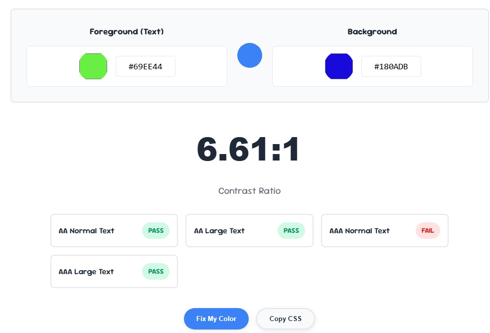
A contrast checker is a tool that measures the difference in brightness between a text color and its background, then tells you whether that combination meets official accessibility guidelines.
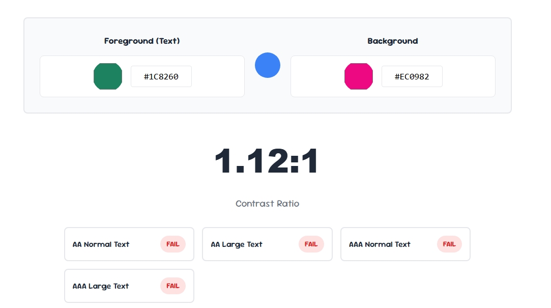
Instead of eyeballing whether text "looks readable," a contrast checker gives you an exact ratio you can compare against published standards.
This matters because low-contrast text is one of the most common accessibility failures on the web, affecting users with low vision, color blindness, and even people reading on a phone in bright sunlight.
1. The 4.5:1 Rule for Normal Text
According to the W3C Web Accessibility Initiative, normal body text must have a contrast ratio of at least 4.5:1 against its background to meet the AA standard.
Run any text and background combination through a contrast checker before publishing to confirm it clears this threshold.
2. The 3:1 Rule for Large Text
Large text — generally 18pt or larger, or 14pt bold — only needs a contrast ratio of 3:1, since bigger letterforms are naturally easier to read even with less contrast.
A contrast checker will usually let you specify font size, since the passing threshold changes based on text size.
3. The 3:1 Rule for UI Components and Graphics
It's not just text that needs checking — buttons, form borders, icons, and other meaningful graphical elements also need a minimum 3:1 contrast ratio against adjacent colors.
A contrast checker helps confirm that interactive elements like buttons are visually distinguishable for all users, not just text.
4. AA vs AAA Compliance Levels
WCAG defines two main compliance levels: AA (the standard most websites and legal requirements target) and AAA (a stricter level requiring 7:1 contrast for normal text).
A good contrast checker shows both pass/fail results side by side, so you can decide whether your project needs to meet the higher AAA bar, such as for government or healthcare websites.
5. Contrast Rules for Dark Mode Design
Dark mode doesn't get a free pass on accessibility — light text on a dark background still needs to meet the same 4.5:1 or 3:1 ratios.
Many designers assume dark mode automatically looks readable, but a contrast checker often reveals surprisingly low ratios in popular dark color schemes, especially with gray-on-black combinations.
Common Contrast Checker Mistakes to Avoid
- Only checking primary text: Don't forget secondary elements like placeholder text, disabled buttons, and captions — these often get overlooked.
- Ignoring hover and focus states: A button's contrast might pass by default but fail once hovered or focused with a lighter shade.
- Assuming brand colors are exempt: Even official brand colors must pass contrast standards — adjust shades slightly if needed rather than skipping the check.
- Not testing with a colorblind simulator: Some passing color combinations are still hard to distinguish for colorblind users — pair your contrast checker with a colorblind simulator for full coverage.
Final Thoughts
Meeting WCAG contrast standards isn't optional anymore — it's essential for usability, legal compliance, and reaching the widest possible audience.
Run every text and background combination through a contrast checker before launch, and pair it with a colorblind simulator to catch issues a standard ratio check might miss.