Colorblind Simulator Guide: 5 Essential Facts About Color Blindness
Millions of people see color differently than you do — and if your website or design doesn't account for that, you could be losing customers without even knowing it.
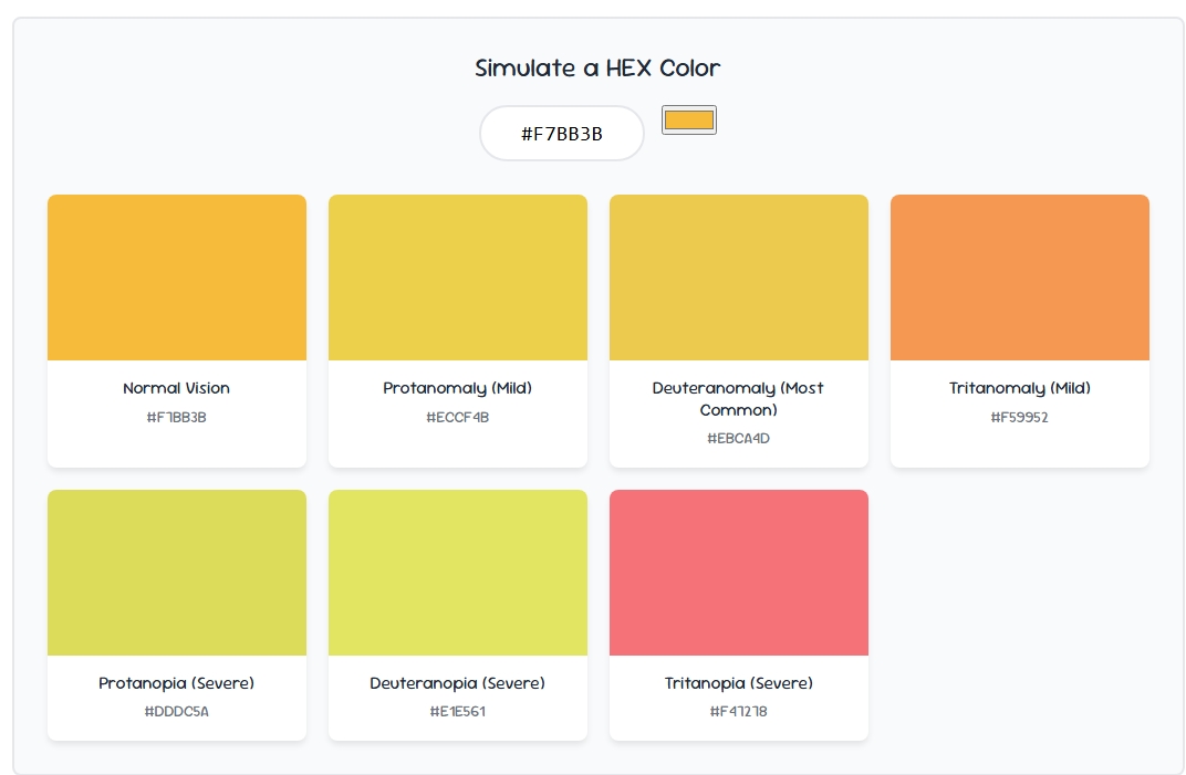
A colorblind simulator shows you exactly how your colors appear to someone with color vision deficiency.
In this guide, we'll cover 5 essential facts about color blindness every designer should know.
What Is a Colorblind Simulator?
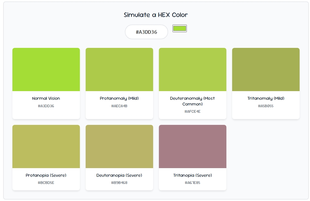
A color-blind simulator is a tool that takes your design, website, or color palette and shows you how it would appear to someone with different types of color vision deficiency.
Instead of relying on assumptions, a color-blind simulator gives designers a direct, visual way to test whether important information is still distinguishable when certain colors can't be perceived normally.
This is especially critical for elements like charts, buttons, form validation states, and any design where color alone communicates meaning.
1. Color Blindness Is More Common Than You Think
According to the National Eye Institute, color vision deficiency affects a significant portion of men, with red-green color blindness being the most common form.
This means a noticeable share of your website's visitors could be experiencing your color scheme very differently than intended, making a colorblind simulator an essential accessibility check.
2. There Are Several Types of Color Blindness
Color blindness isn't one single condition — it includes protanopia (reduced red sensitivity), deuteranopia (reduced green sensitivity), and tritanopia (reduced blue sensitivity), among others. A good color-blind simulator lets you preview your design under each of these different types individually, since a palette that works for one type may still fail for another.
3. Red-Green Combinations Are the Most Problematic
Since red-green color blindness is the most common type, design choices that rely on red versus green to convey meaning — like "red for error, green for success" — are especially risky.
Run these combinations through a color-blind simulator and consider pairing color with icons, text labels, or patterns so the information isn't lost for red-green colorblind users.
4. Color Blindness Affects More Than Just Colors
Beyond just color perception, low contrast between colors can compound the problem for colorblind users, making text or UI elements even harder to distinguish.
This is why a color-blind simulator works best alongside a Contrast Checker together they catch both color-blindness issues and general readability problems in one pass.
5. A Simulator Can't Replace Real User Testing
A color-blind simulator gives you a strong approximation of how colors appear to different users, but it's a simulation, not a perfect substitute for testing with actual colorblind users.
For high-stakes projects like healthcare or government websites, use a color-blind simulator as your first screening step, then validate critical flows with real user feedback where possible.
Common Colorblind Simulator Mistakes to Avoid
- Testing only one type of color blindness: Always check your design against multiple types, not just the most common one.
- Relying on color alone for meaning: Always pair color with text, icons, or patterns so information isn't lost for colorblind users.
- Skipping charts and graphs: Data visualizations are especially prone to colorblind accessibility failures — always test them separately.
- Forgetting to retest after design changes: Any time colors are updated, re-run your palette through a colorblind simulator to confirm it's still accessible.
Final Thoughts
A color-blind simulator is one of the simplest ways to catch accessibility issues before they reach real users.
By understanding these 5 essential facts about color blindness, you can design palettes, charts, and interfaces that work for everyone — not just users with typical color vision.
Pair your colorblind simulator checks with a contrast checker for complete color accessibility coverage.