Color-Wheel Guide: 5 Essential Harmony Rules for Perfect Design
Picking colors that actually work together isn't about luck — it's about understanding a simple visual tool that's been used by artists for centuries. A color wheel shows you exactly which shades pair well, clash, or complement each other.
In this guide, we'll cover 5 essential harmony rules that will help you design perfect palettes every time.
What Is a color-wheel?
A color wheel is a circular diagram that organizes colors based on their relationship to one another, starting with the three primary colors (red, yellow, blue) and expanding outward to secondary and tertiary shades.
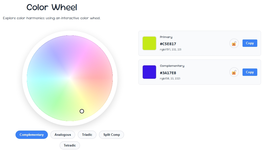
Designers use a color wheel to quickly identify which color combinations will look balanced and which will clash, without relying on guesswork.
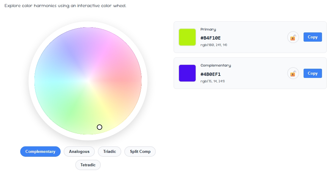
Interactive color wheel tools let you click any point on the wheel and instantly see suggested harmony combinations, making palette-building far faster than manual trial and error.
1. Complementary Colors
Complementary colors sit directly opposite each other on the color wheel — like blue and orange, or red and green.
This pairing creates high contrast and visual energy, making it ideal for call-to-action buttons, sports branding, or any design that needs to grab attention immediately.
2. Analogous Colors
Analogous colors sit next to each other on the color wheel, such as blue, blue-green, and green.
This creates a calm, cohesive look that's commonly used in nature-inspired branding, wellness products, and backgrounds where you want harmony rather than contrast.
3. Triadic Colors
A triadic color scheme uses three colors evenly spaced around the color wheel, forming a triangle — like red, yellow, and blue. This creates a vibrant, balanced palette that works well for playful brands, children's products, or designs that need variety without looking chaotic.
4. Split-Complementary Colors
This rule takes a base color and pairs it with the two colors adjacent to its direct complement on the color wheel, rather than the complement itself.
The result is high contrast like a complementary scheme, but with slightly less tension — a popular choice for modern web design and app interfaces.
Use our Color Picker to fine-tune the exact shades once you've chosen your base color.
5. Monochromatic Colors
A monochromatic scheme uses different shades, tints, and tones of a single color from the color wheel.
This creates a clean, elegant, and highly cohesive look, often used in minimalist branding, luxury products, and professional websites where subtlety matters more than contrast.
Common Color Wheel Mistakes to Avoid
- Using too many harmony rules at once: Stick to one scheme per project — mixing triadic and complementary rules often creates visual clutter.
- Ignoring contrast for text readability: A harmonious palette can still fail accessibility — check your final combo with a Contrast Checker.
- Not testing for color blindness: Certain color wheel combinations, like red-green complementary pairs, are hard to distinguish for colorblind users — verify with a colorblind simulator.
- Choosing colors without a base: Always start with one anchor color from the color wheel, then build the rest of your palette around it.
Final Thoughts
Mastering the color wheel takes the guesswork out of choosing palettes that actually work. Whether you go complementary for bold contrast or monochromatic for subtle elegance, these 5 harmony rules give you a reliable framework for any design project.
Pair your color wheel choices with a contrast checker and colorblind simulator to make sure your final palette works for everyone.